Wednesday 25 April 2018

Evaluation Question 3

What have you learned from your audience feedback?

During any creation process, it is vital to gain audience feedback throughout to ensure that your production intrigues your target audience. Before starting this project, we decided it was important to gather information from the public to gain initial inspiration allowing us to develop a story-line. After this and after solidifying our initial trailer outline, we searched for more insight into our chosen sub-topic of masculinity.

We asked an array of questions on Survey Monkey and presented the analysis of these results in Prezi presentations.

Initial ideas survey Prezi presentation: Survey analysis


Masculinity Prezi presentation: Survey analysis

Evaluation Question 2

How effective is the combination of your main product and ancillary texts?


Full review: Piktochart

The film website:


The film poster:


The final teaser trailer:
Below is a sequence of clips that are taken from the final teaser trailer that we created. Noticeably, they are similar to the shots of those featured within the film website and the film poster, carrying the same colour pallet and mise en scene too. It was important that all our ancillary text complimented each other in order for them all to work as one, unique promotional package which is identifiable to the audience.


The Shape of Water - Website Deconstruction

The Shape of Water - Website Deconstruction


  • Initially whilst the website is loading, this logo comes up and loads up full. This typography is sleek and has relevance to the genre of the film. The screen other than that is in complete darkness.
  • After, you are promptly greeted with the trailer. This is very intelligent, almost forcing you to watch the trailer. If you want to exit this you can close it from the top right corner. 
  • When you close this, it is really easy to navigate around.navigate around. The title of the film would normally be expected to come up, as this is a website convention, yet this website subverts this convention and instead it says 'embraced' in thin white writing. We liked the idea of a water in background so we decided to use it. At the top, there are direct links to actors, extra videos, fan art and opening dates. This can extend the fan loyalty base to an even further extent.

Costuming research

Costuming research

Image result for plain navy hoodie
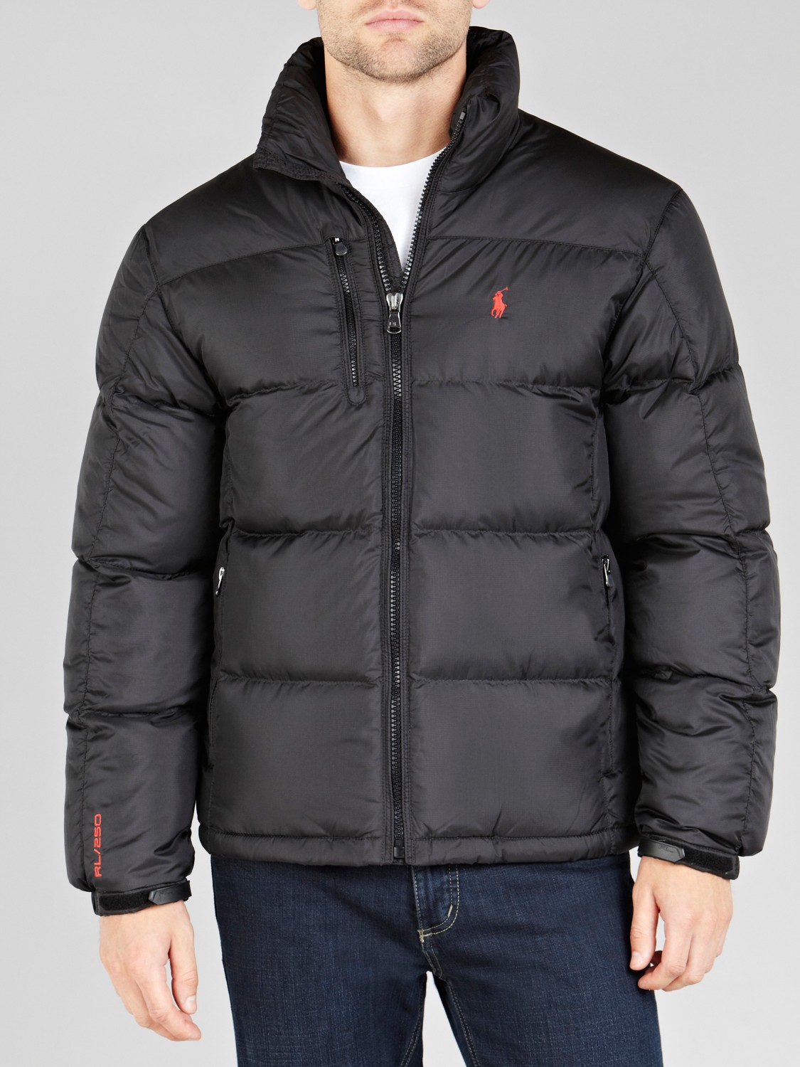
Image result for ralph lauren puffer jacket mensThere is only one character in the opening scene of our film, thus leaving us only one costume to think about.  We decided to use a majority of black and navy clothing  and some blue for the costume. Black is usually associated with  mystery, solitude, which are all relative to the teaser. Underneath the jacket there is a blue/navy hoodie. This colour is similar to that of the colour of the ocean thus linking with the water symbolism throughout the trailer. All black Air Max 97's are also used which had a Nike logo on it which had no relation with the symbolism but it does have a social realistic essence to it. The tracksuit worn underneath was also navy with ever so slight hints of white and blue 

Brotherhood Other social realism films Image result for brotherhood film

Noel Clarke from 'Brotherhood', another film about social realism is wearing almost exactly the same costume apart from the puffer jacket, however he is seen wearing one in some parts of the film 'Brotherhood'. He is also wearing navy jeans in the film and poster. Taking a second look at the majority of the characters from the film, they seem to have the same/similar costume. This was not intentional, but highlights our correct judgement of colour choice to an even further extent.

Evaluation Question 4

How did you use media technologies in the construction and research, planning and evaluation stages?

Across our project we utilised a vast variety of media technologies. Below is the link to a prezi we created to showcase the different technologies we used in all the stages of our project.

Evaluation Question 1

In what way does your media product use, develop or challenge forms and conventions of real media products?

Our teaser trailer conforms to Fowler's 1989 theory that "An individual text within a genre rarely if ever has all of the characteristic features of genre".  To an extent, our teaser trailer conforms to the conventions of our genre (social realism), for example the way in which the social struggles of underprivileged collective groups are told to an audience via individual stories. This means of informing an audience of the harsh realities of contemporary society is integral to the social realism genre, and is utilised in films such as:
  • "London to Brighton" - the danger of prostitution rings is told through the stories of the two main protagonists
  • 'Trainspotting" - the dangerous effects of heroine use on society and friendships is told through the stories of the protagonists
  • "The Selfish Giant" - the injustices and struggles of working class life are presented via the story of Swifty and Arbour
The social issue we wanted to depict was the issue and taboo surrounding masculinity in regards to mental health and expressing emotion. We chose this as we felt it was a zeitgeist issue popular in the media, for example Robert Webb's popular autobiography titled "How Not to Be a Boy" which discusses the conflict between the alpha male archetype and the ability to express and experience emotion.

We adhered to the convention of the protagonist being a young adult, and deliberately cast our character as a non-professional actor in order to reinforce the sense of realism. We were inspired by the casting of Thomas Turgoose in Shane Meadows "This is England" - the actor is unknown and unprofessional which adds a realistic tone.  We casted an 18 year old male with little prior acting experience to ensure we achieved the gritty tone so integral to social realism.

Whilst researching existing real media texts, we noticed that emotion was crucial to the representation of the protagonist. For example, camera techniques are used to reinforce the protagonist's psyche. For example, in the Rocky films, the protagonist is shot using a backwards tracking shot running towards the camera with a blank expression. Although subtle, this shot reflects the protagonist's desire to escape while reflecting his struggle against society's expectations of him. We tried to replicate this within our own media text as we felt as though it was important to depict the inner conflict of our protagonist which is crucial to conforming to the conventions of social realism.

During the research and planning stages of our project we concluded that social realist texts utilise urban, gritty locations. There are no special effects or complexly designed sets. This was a convention we felt imperative to render our teaser trailer as one belonging to the social realism genre, so we chose to shoot our media text in various urban locations, including urban streets, a gritty run-down pier and a dilapidated sea-side town.

Although our media text adhered to many of the genre conventions of social realism, as Fowler recognised texts "rarely if ever [have] all of the characteristic features". With this in mind, we decided to subvert some of the common codes and conventions of social realism. Often, films with a profound social commentary are created with a semi-improvised script to achieve the effect of realistic life-like dialogue. In our piece we subverted this by not including dialogue at all; we wanted to focus primarily on symbolism and aesthetic cinematography to convey our Preferred Reading. We felt that by experimenting creatively with our technique we could adequately convey our protagonist's emotions and feeling, while simultaneously serving as a step away from clear-cut realism. To show creative experimentation without dialogue we:

  1. used varied lighting - i.e. the pink lighting in the boxing scenes
  2. used various locations 
  3. used various camera angles i.e. underwater shot, backwards tracking, vertical tilt
  4. used post-production editing techniques i.e. time-lapse

Adhering to the Conventions of a Teaser Trailer

During the research aspect of our project we listed a specification for a teaser trailer:
  • Sheds a film in the most positive light to a potential audience
  • Scenes are cut and edited into a short sequence
  • The MPAA state that every trailer has to be less than 2 and a half minutes long
  • Must portray the protagonist and any other key characters
  • Must convey the time period in which the film is set
  • Must convey essential aspects of the narrative without giving too much information away
We adhered to all of these points. We clearly displayed our protagonist while informing the viewer of the subject of the film without spoiling the narrative. We did this through the use of symbolism and carefully selected cinematography. 

Tuesday 24 April 2018

Colour within film

The importance of colour within film

Colour in costuming

For costuming we found that all black, blue and white was suitable for our genre of social realism. Due to the more variety of colours of the costume, we were able to manipulate emotions of the audience via the use of colour.

Natural colour

The more we researched into films, the further the knowledge on the importance of colour increased and we promptly came to a conclusion that colour played a large role in film production and film development. Light and colour often accompany one another, seeing as colours are the components of light. Colours portray emotions usually either subtly or very explicitly. Anything that is a source of light or reflects it has an effect on what it's seen on and on the colours of the scene. We thought about our scenes we were going to film in and the lighting that they were going to be in. After some serious consideration we decided that we would use colours like blue, navy, some black and pink. The way we could implement these colours is via costuming and the setting we was in (The seaside, the gym). Colour is vital as it can guide thinking or generate certain reactions.

Colour in editing

Grant Wood's American Gothic (1930) Widely known icon of social realism 

The most effective way to establish a mood was actually post-production editing by editing the contrast, hue and saturation of the scene to generate a 'film type look'. This film look allowed the film opening to maintain a continuous professionalism. Several people were asked about the opening with or without the change in contrast and saturation and they said that they preferred it with the low contrast and saturation. Changing the saturation can make the scene more graphic or dull.

Evaluation of our location choices

Evaluation of Mise en scene

Coast
In our A2 teaser trailer 'Quicksand', we focused on utilising several different locations in order to create the best product possible through manipulating the mise en scene. We travelled to the coast of Margate as well as a pier in order to accomplish the desired shots.
We included several shots of water in order to create our water motif through a use of symbolism shown below:

High-street
A second location was a busy high street where we created a time lapse of our character standing amongst an array of people passing by. This was an effective technique as we aimed to show that although he is visibly surrounded by many people, he still stands alone which helps to highlight the isolation and loneliness. Shown below:

Gym
We also used the gym, specifically a boxing area as a way of demonstrating our character attempting to conform to the typical stereotypes of a male. We pared these shots with pink lighting which hints at more female stereotypes, allowing us to portray that this conformity is only surface deep and that he experiences a deeper struggle because of societies expectations. This helps to develop our story line:

Cafe
As shown below, we used a cafe as another of our filming locations. On reflection we believe this was a successful decision as it enabled us to capture our character in A common urban environment which help reflect the conventions of the social realism genre. It also gave us the opportunity to utilise our digital technology skills through the use of a graphic match which created a interesting visual impact for the audience. The idea behind this was to portray him being happy with his friends but then cut to him being alone and weak, displaying his inner emotions of isolation and loneliness. Shown below:


Evaluation of symbolism in our final piece

Evaluation of the use of symbolism in our final piece

  • We decided that we were going to explore the use of symbolism to develop a representation of the deeper aspects of masculinity which are not usually acknowledged. One of the key representation we stumbled across was the use of water. The idea behind this was that water embodies the fluidity of gender to highlight the fact that gender is purely a social construct, and this is a concept which is often overlooked. 

Evaluation:
We thought that this was a successful idea to use in our final piece as it was a key symbol which we could easily carry across our ancillary texts. It was a creative and contemporary way to portray a different perspective of the public view of masculinity. Below is a short sequence showing how we have used the water motif throughout our teaser trailer


  • Another use of symbolism that we explored during the research process of our final piece was adhering to the common stereotypes attached to masculinity which are prominent in today's society. From our own knowledge from experience and also from completing research, we brainstormed some initial ideas about the stigmas such as: power, dominance, aggression and strength. We wanted to show our character struggling to attempting to conform to these stereotypes shown through the face paced boxing scenes:


Evaluation:
In the first shot it is demonstrating him adhering to the stereotypes of men being strong and powerful, however the second shot occurs later in the trailer showing his dismal face expression and looking downwards shows his weakness and struggle to conforming to these norms. We pared the boxing shots with pink lighting which works well to recognise the more feminine stereotypes.

Media Technology within the creation

Media technologies within our creation

Final Cut Pro:


Final Cut Pro was the program used in the production of our final teaser trailer. Several aspects and the overall piece was created by final cut pro.


Layering:
Layering was essential within the creation of our final teaser trailer. Layering was used with the audio and visuals. As you can see, there are several different layers of audio. There is three continuous audio tracks in total, 2 of these being ambiguous sounds, adding to the overall melancholic effect of the soundtrack. Majority of these tracks evanesce, also for the same reason. Some audio also fades in, which was done by the fade tool , and the reason for this is to create an unprocessed and realistic nature to the audio. The other added audio was diegetic but infact, was added artificially. This was the racket of the chains of the boxing bag and the impact hit of the boxing noises. Initially, this didn't match the scene so I had to change this. I also created a soundbridge, leading to parallel boxing noises which then again adds to the overall effect. To get the impact I desired, direct precision was required which would allow the audio the audio to be synchronous to the scene. Dynamical alterations were made of each boxing impact in relation to the harshness of the impact with the boxing bag to create a genuine result .

Editing:
Quick cut editing was used when needed for a scene where tensions were increased. Again, Final Cut was used for quick precision to gain effectiveness to the overall teaser. Another technique was 'Montage Editing' , which is a series of unconnected sequences , which created the desired effect. This was used in the different running scenes where it flickered between several of these scenes.
Using the Final Cut recourses, we created a flashback , which is a moment in a sequence when an event from previous time prior to that current narrative was shown, to create a scene of solitude.

Photoshop :


Photoshop was used in the creation of the media poster of out teaser. Several techniques was used within Photoshop to guarantee effectiveness within it. One technique used was adding noise/pixelation. This effect had to be subtle but still effective so to find this level was difficult. The effect of this effect would generate an 'old' type look on the poster. To create a further realism and in combination with this effect, the 'Gaussian Blur' was used. Gaussian smoothing/blur is ironically an effect to reduce noise/pixelation but if used right, can have a realistic impact on the image. This is the result of blurring an image by a Gaussian function. It reduces image noise and reduces detail. An image was layered onto the poster which gave it the 'Old movie look' and to do this, blending options were changed to 'Hard light' to generate a genuine essence to the final product and to give it an antique feeling. Coupled with the image added, the 'Burn' tool was used around the outside of the image again contribute to the intended effect of the old movie look. This was also used around the sides of the typography to create a similar effect.


  • Video showing how exposure curves was used in the production of the ancillary text. Also shows the 'Old movie look


'Shank' - Trailer Deconstruction

Shank - Trailer Deconstruction


Structure 

  • The trailer starts with a tornado roundhouse kick, thus plunging the audience straight into the conflict which in involved within the film. Then there is a change in the soundtrack to a melancholic drone which is ongoing with occasional hits and there is quick montage editing of a scene of love. juxtaposed to a quick flicker of fear, anger and rage. After this there is a chase scene of the protagonist being hunted.
  • After this scene, there is a CONSISTENT juxtaposition of love, friends and family, compared to violence, conflict, brutality, more chases and pain; seemingly  accompanied by a loop-voyage consequently ending in more violence and pain. Throughout the whole trailer there is 
  • this constant plot.

Sound

  • The trailer starts with a song called 'Next Hype' which has severe relations to the whole film. The song is filled with an abundance of robbery, violence, drugs, money and girls. (Not much different to most song these days you're thinking). Yet this track isn't implicit whatsoever, but very explicit. It actually mentions stabbing people and robbing houses. 
"If I kick down the door to your flat
Dun Know I'll clear out your house on the spot
(CLEAR!) All the things in your house
(CLEAR!) All the things in your fridge
(SMASH!) All your plates from your rack
(CLEAR!) All of your kids' toys
(CLEAR!) All of your CD rack
Won't get none of your CD's back
Drag off your curtain rail from the wall
Kick off your HDTV from the stand
Run up on stairs into rooms
Flip the mattress and search for the cash
Make man look down the barrel of a mash
It's not worth your life, just cough up the scratch
It's too late to lock up the latch
I can smell the crow, just pull out the batch"

  • The song is abruptly stopped followed by a change in the soundtrack to a melancholic drone which is ongoing with occasional hits. At around 00:16 seconds, there is an eerie screech sound, leading to a dramatic drum soundtrack which is synchronous and parallel to the chase scenes and stops at a heavy kick at 00:32 seconds, where there is a knife in a characters house, thus building up tension within the whole trailer. Then after this there is a violent stabbing scene, accompanied with several on-screen diegetic stabbing noise. This builds up tension up to 00:46 seconds where there is a drop and quick cut montage editing coupled with parallel dramatic drums.

Typography

The typography in this trailer is normally accompanied from heavy kicks in audio and is the same typography throughout the trailer so it maintains continuity. The 'Shank' typography is also carried over from the poster, again maintaining continuity. The text is bold and clean , yet every time the typography comes on , a 'old film' effect is given, due to the overlay on top of it.

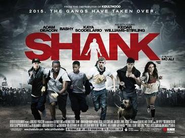
Shank - Poster deconstruction

Shank


Shankposter1.jpg

Colour 


The 2 prominent colour in this poster is blacks and a darker white. These are used in relation to each other actually fading with one another from white to grey to black. A dark red is also used but only in the typography. This is very smart as the title of the film is 'Shank' and the definition of this word to stab, thus allowing the deep colour of red to symbolise for blood. As this is the only red used in the poster, it has a large impact on the audience. There is also a shape of a person within the 'A' in 'Shank' holding what seems to be a knife. Behind the typography, the colour scheme is light and around the light there is dark, allowing the typography to be very distinctive. There is light within the dark, which may have metaphorical meanings.

   Tagline

The tagline of this poster is '2015. The gangs have taken over.' This 1.) Notifies the audience when the film is set and 2.) Has the intent to generate some sort of fear within the audience as the film was released in 2010, yet has a dystopian setting only 5 years from then. To read this tag line and have the idea that in 5 years everywhere could be taken over by gangs would have you curious and possibly hooked.

Typography

The typography as mentioned is the only red on the poster which makes it very obvious and distinctive. The name of the film means 'To stab' which is heavily linked with the colour red and blood, thus the deep blood-like shade of the red. A shape is also cut out of the A in the shape of a person holding a knife. The typography is actually imaged in such a way that it is behind the actors on the poster as if they are running away from the violence in the typography and even the dark crowds of people behind all the actors. Some of these are achieved through post production like the person within the 'A' and the riots of people behind the actors. In the sky there are also a few people and this was again achieved through post production and made more opaque to blend in with the sky, maybe suggesting that this life will eventually conclude with you passed away in heaven/hell, slowly fading away.

Monday 23 April 2018

Poster deconstruction - Adulthood

Adulthood poster deconstruction


  • A common convention of film posters is an impactful title. The film name 'Adulthood' is positioned in the center and written in bold black writing in the same typography as its sequel Kidulthood, creating an identifiable link between them both. The black also works as a contrast on top of the lighter, orange background helping it to create a  more profound acknowledgment. 
  • The title acts as branding for the film and a recognisable image that can be used for film advertising
  • The film poster has several positive film reviews from commended sources giving the impression it is a well acclaimed and loved film. These comments are situated at the top of the poster in text almost as large as the main title. This ensures to immediately grasp the attention of viewers so they instantly know the film is 'phenomenal' as spark their interest. 
  • The main image of the cast is that of a similar style to Kidulthood, where they are positioned in order of importance, with the main character being at the front showing how he is important and  leader of the group. 
  • The characters are wearing very urban, street-ware such as hoodies and jeans, thus reflecting the common conventions of a social realism genre.
  • The colours used for the background is an ombre of warm-toned orange and yellows which is a great change from Kidulthood. this could suggest that this film has hope for a happier ending due to the connotations of the bright tones. 
  • The use of the star rating is a quick and easy way to portray the exceptional reviews the film has.
  • The bottom of the poster explains the release date allowing the audience to be waiting for its release, allowing time for the word to spread and create a greater buzz surrounding the film.
  • The small print also provided the audience with the opportunity to download the film trailer to be downloaded creating a link between the ancillary texts which expands its audience reach. 

Planning & Media

Media technologies in the planning of our trailer

Filming schedule:
One way which we used media technologies to plan the trailer, was the schedule created which we could follow and we had created this on blogger, which was useful as it gave us a precise time so we could be organised and efficient within our filming. This filming schedule was made so that we get enough amount of time to film each shot but also so that we could waste almost no time.


Filming Schedule

Filming Schedule


Location: Erith Pier & Inside shots

1:00pm - Leave school
1:20pm - Arrive at location in Erith
1:25pm - Establish precise location on the pier and set up camera, starting by adjusting the tripod to an appropriate height.
1:30pm - Start filming a few different shots of pier including a few establishing shots
1:50pm - Film different shots of me on pier e.g walking, overlooking water
2:30pm - Running tracking shots with car, several of these to have a variety
3:20pm - Go home and set up for the inside shots
3:35pm - Film closeups in mirror, closeups of razor, blood shots
4:00pm - Take shots inside bath with clothes on , blood in water , POV shots


Location: Margate & Chinese solitude

11:00am - Leave school
12:15pm - Arrive at Margate
12:25pm - Location scouting for best suitable place for filming
12:35pm - Start filming stationary running shots down beach, get some establishing shots
1:00pm - More running shots in different setting
1:30pm - Take a huge amount of photos of the scenery and the protagonist for the poster
2:00pm - Few more running shots again in different setting, closeups
2:20pm - Leave Margate
3:35pm - Arrive at Chinese + order Chinese
3:40pm - Take several Mid shots of lonely Chinese ingestion with tripod


Location: Gym & Outside shopping precinct

1:00pm -  Leave school
1:20pm - Arrive outside shopping precinct and film 15 minute time lapse
1:35pm -  Leave shopping precinct and go to gym
1:45pm - Arrive at gym and start filming boxing shots
2:00pm - Film workout shots and some setting establishment shot
2:15pm - Film more boxing scenes and try film audio only of the boxing bag
2:25pm - Water shots , drinking water , and sweat on face closeup
2:35pm - Film lifting weights, looking at myself in mirror and using hairdryer


Location: Cafe

3:35pm - Leave school
3:45pm - Arrive at Cafe + order food + take few shots with and without friends in shot
3:55pm - Take more shots with + without friends in the scene to show more loneliness

Saturday 21 April 2018

Website deconstruction - The Hunger Games

The Hunger Games - Website deconstruction


The four action adventure films within the Hunger Games series are based on The trilogy of novels, by the American author Suzanne Collins and have proven to had huge global success. 


  • The immediate focus when the webpage is opened is the title, written in a bold font which is the same typography carried throughout all of the films. The colour is much lighter and huge contrast to the background colour continuing to make it stand out.
  • The slogan 'every revolution begins with a spark' is a powerful portrayal of the film, and it provides a unique attachment to the film making it more memorable. 
  • It is noticeable that in the top right corner there are 'share' and 'follow' hyperlinks. This provides access to several of their other media platforms to expand their media influence and reach a larger audience. It informs people that The Hunger Games also has a twitter and Facebook which they can interact with allowing fan interaction too, thus spreading the global reach
  • The film trailer automatically plays when entered into the website so viewers automatically watch it which could interest them
  • There are also large image of the film DVD as well as promoting the other films within the series, and these are all linked to a page to purchase it, making it easy for viewers to buy improving the films overall proceeds.
  • Several links at the bottom provide easy access to buy the movie' 
  • The colour palette of the website is complementary to the website and film itself thus creating an identifiable brand continued through the series


Comparing ancillary texts

Evaluation of our ancillary texts


We identified that our teaser trailer, website, and poster must all work together as a promotional package in order for us to create a unique brand that would be identifiable to the audience. We evaluated our effective use of the ancillary texts in a Piktochart presentation.


Initial ideas survey analysis

Initial ideas survey analysis

Before starting this project, we decided it was important to gather information from the public to gain initial inspiration from to ensure that our production met the desires of our target audience. We asked an array of questions on Survey Monkey and presented the analysis of these results in a Prezi presentation: Prezi presentation of initial ideas survey analysis

Thursday 19 April 2018

Media technologies within our research

Media technologies within our research

Research

 -Search Engines


Google, Bing, Yahoo:


To research for the information required, search engines were required to obtain the knowledge, as this is extremely beneficial, easily accessible and was the 'go to' information outlet.The most persistently used search engine by our group and
most likely by the majority of the population would be 'Google'
The reason for this is that Google generates more relative information than any other search engines even by typing a few key words related to the subject.
However, initially other search engines were used for example 'Bing' or 'Yahoo' but we found that Yahoo wasn't as effective, as not many search results were generated as Google. Bing was also used at first, but we found the same problem and some even go as far to say Bing is an acronym for 'Because It's Not Google', but this is obviously a joke shared by many, even highlighting the publics extending preference to Google.


Youtube:
                                             
Youtube is very effectual in the subject matter of research, as you are able to find very precise and relevant videos to aid in all aspects of production of the coursework. These videos are step by step and you have a high variety of videos if you don't like or find it hard to understand a particular video you watch, therefore making it an also great way to research. There is also many videos and clips of films already produced , or already created coursework pieces on Youtube in which we used for inspiration. To get a wider understanding on the genre of our trailer, we also watched many social realism trailers, alongside with this we had viewed many videos on masculinity and attempted to increase our knowledge and attain a broader understanding of how boys and men learn “appropriate” gender roles in accordance to the masculine expectations of their given society. As a result, we also had to understood that from very early on boys get messages on what it means to be a boy.

Survey Monkey:

When brainstorming our first ideas for the genre of our teaser trailer, we agreed on 'Social Realism'.
We then discussed what the theme was going to be and how we would portray the theme. It is essential to do research to get a better understanding of what the our audience would prefer. As a result of this, before creating the project, we created a survey on Survey Monkey, targeted at potential members the audience, as this is an effective way to gain information to help target our initial ideas on what would be more effectual.


As you can see we used Youtube to view the Rocky scene and we had been inspired by it, and created almost a mirrored scene.


Wednesday 18 April 2018

Website Deconstruction - Room

Website Deconstruction - Room


  • The GUI of the website is cleverly designed - the website transitions onto the screen to form a room-like box.
  • Interestingly, the user is not taken straight to the webpage but to an initial homepage where they have to click "Enter site' to visit the page - is this something we would consider incorporating into our own website?
  • The initial webpage displays a photograph occupying the screen of the two protagonists embracing, giving a hopeful tone to the film.
  • A key point to note from this website is that the colour palette used frequently throughout the film is used in the website.
  • The colour is consistently cool toned and blue, with a contrasted yellow font
  • The website shows the awards the film has received - the cover webpage shows an image of the iconic oscar award to inform the viewer of the success of the film.
  • Once the viewer clicks "enter site", sound and video are utilised as a clip from the film plays alongside a soundtrack of the main protagonist's signing voice. This establishers to the viewer the fact that a relationship exists between the two characters.

What inspiration can we draw from this?

  1. The use of a similar colour and font scheme to establish a clear promotional package.
  2. The slideshow of critics' feedback appearing at the top of the webpage - the text appears one after the other so as to not appear overbearing
  3. The use of a

Tuesday 17 April 2018

Progression from Storyboard

Progression from Storyboard

In the initial idea stage of our project, I drafted a storyboard depicting the shots and angles we wanted to use when filming our teaser trailer. Prior to drawing the storyboard, we visited the various locations in order to grasp the aesthetic and cinematic effect of each said location. Now that we have filmed and edited our teaser trailer we are able to review our media text against the initial storyboard to reflect on the changes we made.


Above is the storyboard I created before we starting filming our teaser trailer. Listed below are the changes we made to each shot.
  • Shot #1: We decided to keep this shot as our establishing shot as we felt it served as an apt initiation of the teaser trailer's urban setting. Upon arrival at the pier, we came across a pair of young boys on bicycles. We asked permission for them to appear in our film, and instructed them to cycle towards the camera. We timed the shot against a backdrop of fleeting birds as we felt they acted as a symbol of freedom as well as adding an aesthetic quality to our trailer opening.
  • Shot #2: We filmed this shot, however placed it later on in the teaser trailer to adhere better to the narrative. We filmed this shot in a gym where we were able to change the lighting - we wanted to experiment with gender and colour thus we lit the shot with florescent pink lighting to contrast the feminine colouring with the masculine image of boxing. Furthermore, whereas the storyboard noted that we should capture the diegetic sound of boxing gloves impacting on the punchbag, when we arrived at the gym there was loud music which obscured our microphone and interfered with the sound. To resolve this we actually found a boxing sound online and layered over the video footage carefully in order to make it seem diegetic rather than non-diegetic.
  • Shot #3: We liked the prospect of having a montage of backwards tracking shots to reflect the longevity of our protagonist's run. We filmed this by mounting the camera onto the dashboard of a car and slowly reversing with our actor running towards us with a blank expression.
  • Shot #4: In our storyboard we didn't specify which locations we would use for the graphic match of our protagonist's head in his hands. We ended up filming him both at the gym and at home in the bath. We did this to reflect our character's inner struggle: the first shot of his head in hands appears to be an action driven by exhaustion after boxing - a masculine stereotype - and the second shot of his head in his hands in the bathtub appears to be driven more by emotional exhausted and trauma. This epitomises the characterisation of our protagonist as we wanted to depict how he presents himself to society in comparison to how he feels internally. The graphic match blurs the lines between expressions of 'masculine' exhaustion and 'emotional' exhaustion.
  • Shot #5: We included a vertical panning shot of the view from the pier but we removed the star rating as felt this did not sit well with our genre of social realism. Instead, we included a simple review.
  • Shot #6: We kept this shot intact, shooting the running feet against a graffiti-covered wall
  • Shots #9 and #10: We shot these indoors, using an underwater camera to film the blood droplets. We also included a very brief shot of a bloodied razor blade. Although subtle, when coupled together these shots are reminiscent of self-harm.
  • Shot #11: We travelled to Margate, Kent to film this shot.
  • Shot #12: We chose to shoot our protagonist in a shopping centre using a time lapse. We kept our protagonist still while people moved around him. We wanted to depict the sense of isolation felt by our character as even when he is in a busy setting he feels alone.
  • Shot #13: We decided to frame our protagonist sitting on a bench, through the metal bars to symbolise entrapment.
  • Shot #15: We filmed this scene in Margate with our protagonist running towards the camera. We kept the symmetry intact.
  • Shot #16: We actually chose to remove this shot as we felt we could focus more on subtle symbolism rather than explicit symbols of archetypal masculinity.
  • Shot #18: We did shoot this scene, however we didn't end the sequence with it. We chose to end the sequence with a shot of our protagonist against the sea.

Media Theorist - Dyer

Due to our piece being part of the social realism genre, it it important to consider how we represent the collective group we are trying to shed light on. Media theorist Richard Dyer (1983) suggested that when analysing media representations we ought to pose the following questions:

What sense of the world is it making?

The sense of the world we created from a negative perspective – we wanted to depict the internal struggle of our protagonist. We included a time-lapse shot of our protagonist in a busy shopping street with him standing still with people moving around him. In post-production we sped this up to indicate the length of time he was standing there, making the world around him seem more isolating. His ordeal becomes decentralised as his story is silenced by society – this is poignant in the quick cut edited mid-shots jumping from him being with his friends in a cafĂ© to a match-on-action of him being alone, suggesting that although there are friends around him, he cannot reach out and feels alone. Despite companionship, the world is made sense of as a lonely place for the protagonist. Our narrative is absent of a villain because we were attempting to highlight how the society surrounding the protagonist is the villain: as our piece is a social representation on the treatment of men in modern culture.

“Who is it speaking to? For whom? To whom?”

 Our piece is speaking to society to make a change on the attitudes towards men in regards to mental health issues, but also speaking to the women themselves who’ve experienced this ordeal, this message is portrayed from the voice of the victims themselves. Provoking compassion to their voices was then achieved through our use of shooting footage that depicted our protagonist as both vulnerable and isolated. We achieved this through the use of graphic match of a bird’s-eye shot of our protagonist in the foetal position, highlighting her fragility and suffering, as she appears almost child like. The use of two settings one being her domestic bedroom, the other being the woodland, where the rape happened, demonstrates that even when she is in the safe environment of her bed epitomised in the white colour palette and softer haven like setting, she cannot escape her trauma. This extremely emotive, and in some aspects disturbing, footage was how we supported this theory since this is how we was able to visually represent the voices of the victims.

Monday 16 April 2018

Media Representations in our Teaser Trailer


How did we represent our particular collective group?

Due to our teaser trailer being in the genre of social realism, a heavy focus is placed on how we choose the represent the social group we are choosing to shed light on. In the case of our media text, we focussed on the fragility of the male psyche in a society where expressing emotion is taboo in male culture. Indeed, it cannot be ignored that by definition, all media texts are representations of reality. We wanted to replicate what we saw in the world around us onto the characterisation of our protagonist. Media texts are intentionally composed, written, framed, cropped and targeted by their producers, and are artificial versions of the reality we perceive around us - and our media product served no exception. Media representations are a representation of someone’s concept of existence, codified into a series of signs and symbols which can be decoded by an audience. They are a fluid, two-step process: producers position a text somewhere in relation to reality and the audience assess a text based on its relationship to reality.