
Showing posts with label Social Realism. Show all posts

Wednesday, 25 April 2018

Costuming research

Costuming research

Image result for plain navy hoodie
Image result for ralph lauren puffer jacket mensThere is only one character in the opening scene of our film, thus leaving us only one costume to think about.  We decided to use a majority of black and navy clothing  and some blue for the costume. Black is usually associated with  mystery, solitude, which are all relative to the teaser. Underneath the jacket there is a blue/navy hoodie. This colour is similar to that of the colour of the ocean thus linking with the water symbolism throughout the trailer. All black Air Max 97's are also used which had a Nike logo on it which had no relation with the symbolism but it does have a social realistic essence to it. The tracksuit worn underneath was also navy with ever so slight hints of white and blue 
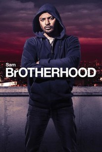
Brotherhood Other social realism films Image result for brotherhood film

Noel Clarke from 'Brotherhood', another film about social realism is wearing almost exactly the same costume apart from the puffer jacket, however he is seen wearing one in some parts of the film 'Brotherhood'. He is also wearing navy jeans in the film and poster. Taking a second look at the majority of the characters from the film, they seem to have the same/similar costume. This was not intentional, but highlights our correct judgement of colour choice to an even further extent.

Tuesday, 24 April 2018

'Shank' - Trailer Deconstruction

Shank - Trailer Deconstruction


Structure 

  • The trailer starts with a tornado roundhouse kick, thus plunging the audience straight into the conflict which in involved within the film. Then there is a change in the soundtrack to a melancholic drone which is ongoing with occasional hits and there is quick montage editing of a scene of love. juxtaposed to a quick flicker of fear, anger and rage. After this there is a chase scene of the protagonist being hunted.
  • After this scene, there is a CONSISTENT juxtaposition of love, friends and family, compared to violence, conflict, brutality, more chases and pain; seemingly  accompanied by a loop-voyage consequently ending in more violence and pain. Throughout the whole trailer there is 
  • this constant plot.

Sound

  • The trailer starts with a song called 'Next Hype' which has severe relations to the whole film. The song is filled with an abundance of robbery, violence, drugs, money and girls. (Not much different to most song these days you're thinking). Yet this track isn't implicit whatsoever, but very explicit. It actually mentions stabbing people and robbing houses. 
"If I kick down the door to your flat
Dun Know I'll clear out your house on the spot
(CLEAR!) All the things in your house
(CLEAR!) All the things in your fridge
(SMASH!) All your plates from your rack
(CLEAR!) All of your kids' toys
(CLEAR!) All of your CD rack
Won't get none of your CD's back
Drag off your curtain rail from the wall
Kick off your HDTV from the stand
Run up on stairs into rooms
Flip the mattress and search for the cash
Make man look down the barrel of a mash
It's not worth your life, just cough up the scratch
It's too late to lock up the latch
I can smell the crow, just pull out the batch"

  • The song is abruptly stopped followed by a change in the soundtrack to a melancholic drone which is ongoing with occasional hits. At around 00:16 seconds, there is an eerie screech sound, leading to a dramatic drum soundtrack which is synchronous and parallel to the chase scenes and stops at a heavy kick at 00:32 seconds, where there is a knife in a characters house, thus building up tension within the whole trailer. Then after this there is a violent stabbing scene, accompanied with several on-screen diegetic stabbing noise. This builds up tension up to 00:46 seconds where there is a drop and quick cut montage editing coupled with parallel dramatic drums.

Typography

The typography in this trailer is normally accompanied from heavy kicks in audio and is the same typography throughout the trailer so it maintains continuity. The 'Shank' typography is also carried over from the poster, again maintaining continuity. The text is bold and clean , yet every time the typography comes on , a 'old film' effect is given, due to the overlay on top of it.

Monday, 23 April 2018

Poster deconstruction - Adulthood

Adulthood poster deconstruction


  • A common convention of film posters is an impactful title. The film name 'Adulthood' is positioned in the center and written in bold black writing in the same typography as its sequel Kidulthood, creating an identifiable link between them both. The black also works as a contrast on top of the lighter, orange background helping it to create a  more profound acknowledgment. 
  • The title acts as branding for the film and a recognisable image that can be used for film advertising
  • The film poster has several positive film reviews from commended sources giving the impression it is a well acclaimed and loved film. These comments are situated at the top of the poster in text almost as large as the main title. This ensures to immediately grasp the attention of viewers so they instantly know the film is 'phenomenal' as spark their interest. 
  • The main image of the cast is that of a similar style to Kidulthood, where they are positioned in order of importance, with the main character being at the front showing how he is important and  leader of the group. 
  • The characters are wearing very urban, street-ware such as hoodies and jeans, thus reflecting the common conventions of a social realism genre.
  • The colours used for the background is an ombre of warm-toned orange and yellows which is a great change from Kidulthood. this could suggest that this film has hope for a happier ending due to the connotations of the bright tones. 
  • The use of the star rating is a quick and easy way to portray the exceptional reviews the film has.
  • The bottom of the poster explains the release date allowing the audience to be waiting for its release, allowing time for the word to spread and create a greater buzz surrounding the film.
  • The small print also provided the audience with the opportunity to download the film trailer to be downloaded creating a link between the ancillary texts which expands its audience reach. 

Monday, 16 April 2018

Website Deconstruction - Moonlight

Website Deconstruction - Moonlight


  • The initial webpage when the website is clicked on shows a fading transitional slide show of the three stages of Chiron's life as he appears in the film. This indicates to the viewer that these characters play an integral role in the narrative - the three men signalling that themes of masculinity are prominent within the film.
  • The title is clear and distinct across the screen, however is written using a delicate typography so as to not distract the viewer from the photography. 
  • The photographs occupying the entire screen are particularly emotive - the heavy focus on eyes provoking empathy from the viewer. As a group we can hopefully take inspiration from this apt use of a still image to convey a meaningful message. 
  • The webpage also utilises social media by including links to the film's twitter, facebook and instagram. The links are small and discreet, however still legible in a white font. 
  • The tagline features on the webpage, however is relatively discreet in relation to the film's title. The Academy Award for 'Best Picture' is privileged over the tagline as it is more likely to attract potential viewers.
  • It is interesting to note the use of "Follow the story" in the bottom left hand corner of the webpage. The arrow underneath it signals the viewer to scroll down - leading them towards the rest of the webpage which has a scroll interface similar to those of popular social media networks. The simple scroll nature of the website is aesthetically pleasing and comfortable for use, especially for younger audiences as the website reads similarly to a blog or twitter feed.
  • "Follow the story" resonates as something giving the film a narrative that extends beyond the film itself. Being a talked-about zeitgeist film due to its theme of masculinity and predominantly black cast, the film is more than just a story. Black men are statistically greatly underrepresented in the film industry, making "Moonlight" a story of black success made evident by its website.

  • Above is a screenshot of part of the website. The website features headlines in a news outlet style fashion, with images and transitioning text adding aesthetic value to the site.

What inspiration can we take from this?

  1.  A website that flows - allows for easy viewing, modern and aesthetically pleasing.
  2. Image focussed - aesthetically pleasing as image is able to dominate the screen
  3. Suitable privileging of typography - most important text to be the largest
  4. Inclusion of reviews

Thursday, 12 April 2018

Trainspotting - Poster Deconstruction

Trainspotting - Poster Deconstruction

Rob O'Connor, the owner of Stylorouge (the firm that designed the original Trainspotting poster) said that "We didn't really want it to look like any other film poster."

The poster does not follow the traditional conventions of a film poster - it is constructed with simply three colours - orange, white and black. The bright orange colour palette adds a unique and recognisable element to the poster, along with the Helvetica typography resembling the type of font one might see on hazardous materials or a prescription drugs. 

The actors are shot in character, each posing in a way that divulges some detail of their character - for example Begbie is shot posing two fingers towards the camera, which is indicative of his crude and violent character. Similarly, Ewan McGregor who plays Renton is soaked in water for the shot which is reminiscent of the scene in which he climbs into a public cubicle to retrieve his lost opiates. The characters are all shot facing the audience, breaking the fourth wall which adds an eye-catching and personalised touch to the poster.

The black and white shots of the actors arguably reflect the drab and dull nature of the character's lives. Although the drug use which is recurrent in the film is not made completely obvious, it is subtly hinted at. Renton appears cold and shivering, which is a common symptom of drug use. Colour is also utilised with the use of bright orange being reminiscent of prison uniforms - reinforcing the notion of entrapment in the narrative

The poster makes an effort to market unique selling points of the poster - by including text "from the makers of Shallow Grave" fans who have seen the film will be tempted by the new project. Similarly, the review stating "Hollywood... Your time is up" is designed to attract more of a niche, cult following rather than a generic US box office.


Friday, 30 March 2018

Fishtank - Trailer Deconstruction and Inspiration

Fishtank - Trailer Deconstruction


Andrea Arnold utilises the Fishtank's teaser trailer to depict the protagonist Mia as a misunderstood teenager, bound by her disadvantaged family background. The trailer includes stock images of the council estate she resides in, reflecting Arnold's Preferred Reading that Mia has been failed by society. The high angle shot of Mia looking down the stairs at her mother after their argument portrays the separation between the pair, and the lack of love and closeness. This notion of Mia lacking affection is crucial to the narrative as she seeks love from her mother's boyfriend, Connor.

Arnold places the trailer against a soundscape of a dramatic non-diegetic soundtrack alongside the diegetic on-screen sounds. The music is parallel to the pace of the trailer, building tension leading to a climax that we see at the end with Mia dancing. This gives the audience a subtle insight into the narrative as Mia's dream of becoming a dancer becomes apparent.

Monday, 26 March 2018

Our Final Piece

Our Final Piece

This is our final piece 'QUICKSAND'.


In our final piece we demonstrated a variety of media skills and technologies, both in the planning of the piece and the post-production editing.

Our favourite and arguable most crucial shot is the varying shots of our protagonist running. We used match-on-action shots throughout to show continuity, as well as including an extreme high angle shot of him running towards the camera.

The most difficult aspect of our teaser trailer was retaining subtlety while clearly depicting the protagonists struggle. One way in which we did this was by shooting the protagonist in the same setting both alone and laughing with friends. We wanted to depict how even when he is surrounded by others he feels alone.

via GIPHY

If we were to start this project again the weaknesses which we would focus on particularly would be our shots of symbolism. Masculine symbols such as the boxing scene, running and close ups of perspiration could perhaps have more relevance to the plot. Similarly, we could perhaps experiment more with sound, incorporating maybe a voiceover or on/off-screen diegetic dialogue.

Monday, 12 March 2018

Media Theorist - Fowler

Genre theorist Alastair Fowler (1989) stated that "an individual text within a genre rarely if ever has all of the characteristic features of genre". To an extent, our teaser trailer conforms to the conventions of our genre (social realism), for example the way in which the social struggles of underprivileged collective groups are told to an audience via individual stories. Fowler's recognition that media texts rarely display all characteristic features is one we felt crucial to creating a successful media product. Media products that follow rigid characteristics and conventions are often dull and childlike, manifesting in the form of fairytales or fantasy fiction. With a more complex social genre such as social realism, we felt that it was important we experimented with genre.

We did this through the following techniques:
  1. used a lack of dialogue
  2. used symbolism and experimental editing rather than naturalistic straight cut edits
  3. used only one protagonist in the trailer to convey isolation - typically social realism texts portray a group of characters
  4. subverted the stereotypes of the collective group being represented in our piece - although he showed signs of hyper-masculinity our character was fragile and vulnerable

Thursday, 22 February 2018

Poster Deconstruction - This is England

This is England

Colour


  • The first thing I chose to focus on was the use of colour. The prominent colour scheme is red, white and blue which are the colours of the Union Jack. 
  • Due to the subtle association of these colours with skinhead groups such as the English Defence League and Britain First, the colours coupled with the film's title indicate to the audience the general thesis of the film.  
  • The general colour palette of the poster is a collection of blue, grey and red hues. Continuing the colours of the union jack, the poster is aesthetically pleasing. Below is a colour chart I made depicting the various hues used.

Mise en Scene

  • The characters are dressed in stereotypical 'skinhead' outfits - combat boots, bomber jackets and Ben Sherman shirts - giving away details of their character.
  • High rise flats are in the background of the shot - indicates the film is set in a poor area.

The Tagline

  • The tagline "Summer 1983. A time to stand out from the crowd." gives away when the film is set.
  • The notion of standing out from the crowd relates to the mise en scene of the character's costumes and hair/makeup.

Post Production

  • It is possible that the actors were positioned alongside each other for the photograph, however it is likely that they were placed individually against a green screen in order to be edited onto the background.
  • Film festivals and award logos are placed horizontally along the top of the poster - they are placed against the blue sky in order to stand out.
  • The text is placed carefully in order to not obscure any of the buildings or characters.
  • The film's website address appears on the poster.
  • Critics' reviews of the film appear at the top of the poster, persuading the audience that the film is worth watching.

Typography

  • The style of the 'THIS IS ENGLAND' main title is the largest and boldest text on the poster.
  • The typography is styled as thought it has been painted onto corrugated metal - indicating an urban setting for the film.


Monday, 19 February 2018

Trailer deconstruction - Brotherhood

Trailer deconstruction - Brotherhood


Structure

  • The film starts with a time lapse of London from day to night with a voiceover saying 'Times Change'
  • There are then quick montage scenes of London, concerts, family, police and death up to 0:13 seconds. 
  • Throughout the majority of this trailer there is quick fast paced editing often followed by montages. 
  • After 0:13 seconds, there are scenes violence, death, love , sex, money , family and multiple scenes representing solitude. 
  • The violent/chase scenes are more short montage editing , whereas love and family seem to be more prolonged. 
  • The last scene is the main protagonist looking down, seemingly after a fight with a face full of scratches and once again he is in solitude.

Sound

In the first scene where there is a time lapse of London from day to night, firstly there is a cinematic trailer impact sound, followed by an offscreen, yet diegetic narrative saying 'Times Change'. This goes with the scene is it shows the transition from day to night in London.
The narration then continues, also accompanied by the non-diegetic impact hit, which is synchronous to the scene with the quick cut editing. We then find out this was all a soundbridge at 0:11. At 0:13 seconds  uk hip-hop starts playing which comes to an end at 0:24 seconds. This is all part of the tension build and at the second drop UK grime is played at 0:33 seconds. At 0:37 the grime pauses and plays once again at 0:40 when an action scene has started. These stops and starts of the music all contribute to the overall effect and tension of the trailer enticing the audience. From here on, the cinematic 'boom' sound effect starts again synchronous to every new action scene shown.

Typography

  • The typography is clean and bold and white in all-caps. In other genres like this there would be an overlay in the 'old movie' effect, however in 'Brotherhood' the font itself has the effect of an older movie 

Tuesday, 28 November 2017

Character Stereotypes (British Working Class Youth)

Common Stereotypes of British Working Class Youth

Social realism tends to focus on the hardships of the working class. Below is a mindmap I created showing the common stereotypes of the British working class youth.

How can we conform to these stereotypes?

  • Our protagonist will wear sportswear as this commonly fashionable amongst young people.
  • Our protagonist will perhaps come from a poor area.
  • We could incorporate ideas about gang culture.
  • Our protagonist may engage in mild anti-social behaviour, for example spitting.

How can we subvert these stereotypes?

  • Our protagonist will not be aggressive or unpleasant.
  • We will depict the inner struggle of our protagonist alongside the exterior depiction of his masculine self.
  • Our protagonist will be portrayed as vulnerable rather than aggressive.
  • Our protagonist will not be portrayed as uneducated.

Poster Deconstruction - A Way of Life

Poster Deconstruction - A Way of Life


  • The poster is split into three sections - the ground, sky, and the protagonist's eyes.
  • The poster contains the film certificate, which we could potentially include on our poster (especially if our film has a high age rating)
  • The film's title is the biggest text on screen
  • Amongst the clouds are film critic's reviews
  • A naturalistic colour palette is used - blues and greens. 

Monday, 20 November 2017

Political Climate within Social Realist Films

Political Climate within Social Realist Films

As listed in the codes and conventions of social realism, I touched upon the fact that social realist films are typically set among a socio-political backdrop of political unrest. I decided to research existing texts where the respective political climate serves as a catalyst for narrative development.

This is England

One film that does this clearly is 'This is England'', directed by Shane Meadows. The character Shaun's father died in the Falkland's War, and the repercussions of this occur throughout the film. More generally, the misfortunes of the characters in the film are portrayed to be resultant of Thatcher's government of England. The North of England was most profoundly affected be Thatcher's closing of industrial work, leading to mass unemployment and a loss of national identity. 'This is England' highlights how many young people joined the skinhead movement as an act of defiance and as an attempt to reclaim their lost national identity.

How will we incorporate the current political climate in our final piece?

An issue with a dominant presence in current society is the issue of mental health and masculinity. Suicide is the biggest killer of young men and this is an issue that is partially resultant of societally inflicted gender stereotypes. Men feeling as though they are unable to speak out about their emotions and issues leads to an increase in mental health issues among males, and this is an issue we wanted to discuss in our piece.

Our film will contain a character-driven plot, focussing on the nuances and subtleties of the protagonist's character and struggle. We will use juxtaposing images of stereotypical masculinity contrasted with images suggestive of mental health issues, showing how the latter are often hidden behind a facade of 'toughness'.

Codes and Conventions of Social Realism

Codes and Conventions of Social Realism

The genre we have chosen for our film is social realism, as we felt this would be best for reflecting ideas of masculinity through a character-driven plot. Before starting the filming process I decided to make a list of conventions we wanted to adhere to.

  • Social realist films reflecting the British working class are typically shot in dilapidated, gritty urban locations.
  • Issues surrounding the lack of social mobility in working class areas are often highlighted through the characterisation and mise en scene.
  • The style of camera work is often similar to that used in documentaries.
  • Mise en scene is often very detailed and thoughtfully constructed, with plenty of symbolism, serving to further embed the representations presented in the minds of the audience.
  • The youth of today's society are often portrayed negatively - we can choose to either conform or challenge these stereotypes.
  • Social realist films often feature little action and complex narratives - they are driven mainly by character developments. 
  • Actors are natural and realistic to portray a relatable narrative.
  • The characters often face hardships due to socially reinforced circumstances.
  • Social realist films are typically relevant to the political climate of the time, for example 'This is England' which is based at a Thatcher led government of political unrest.
Each of these conventions are important in distinguishing social realist films, and we will use them for inspiration when we begin to film. 

Thursday, 12 October 2017

Poster deconstruction - Kidulthood

Kidulthood poster deconstruction

Related imageImage result


There are several conventions of a film poster. The title of the film coupled with the typography can sometimes hint at the genre of the film. The tagline is used to promote and hook the audience. In this case the tagline is 'Streets of London'. In this case you may be able to as a viewer not having any knowledge of the film , have an idea of what the film may be about with just the typography and tagline. Website and social media links are also included which encourages the audiences to look at the social media and to talk about the film on social media which would result in an increase the amount of attention from other viewers. On the Kidulthood poster on the left, there is a rating of five stars and a review of the film from a commended source radiating a overall positive review of the film. The main image of the cast is that of a similar style to Adulthood, where the actors are positioned in such a way of importance , however unlike Adulthood where the main character was at the front, in this case he is at the far right. Characters in the Kidulthood poster are wearing urban street clothes like jeans , puffer jackets and hoodies, thus further highlighting the common conventions of a social realism genre. Once again unlike Adulthood, the colours used are not ab ombre of warm-toned orange and yellows, but very dark black, greys and silhouettes of the London estate blocks in the background, suggesting that this is all there is to these blocks. Ambient darkness which they all want to turn their backs to. The star rating of five is easy and a quick way to portray the exceptional reviews that the film has. Once again unlike Adulthood, there is no release date on the poster, which in this case doesn't allow the audience to be waiting for the release and it potentially could create less of an excitement and a decrease in the hype for the film. In Kidulthood, unlike Adulthood, there is no opportunity to download the film trailer from the ancillary text, therefore it is hindered in its expansion of audience reach. 
All of this hinderance is reflected in the total box office generated from both Kidulthood and Adulthood.

The total box office for Kidulthood was £1,530,876, compared to Adulthood which generated £3,247,811. Kidulthood generated less which could arguably be due to the better relationship between audience and film which was due to the poster.