Showing posts with label Deconstruction. Show all posts

Wednesday, 25 April 2018

The Shape of Water - Website Deconstruction

The Shape of Water - Website Deconstruction


  • Initially whilst the website is loading, this logo comes up and loads up full. This typography is sleek and has relevance to the genre of the film. The screen other than that is in complete darkness.
  • After, you are promptly greeted with the trailer. This is very intelligent, almost forcing you to watch the trailer. If you want to exit this you can close it from the top right corner. 
  • When you close this, it is really easy to navigate around.navigate around. The title of the film would normally be expected to come up, as this is a website convention, yet this website subverts this convention and instead it says 'embraced' in thin white writing. We liked the idea of a water in background so we decided to use it. At the top, there are direct links to actors, extra videos, fan art and opening dates. This can extend the fan loyalty base to an even further extent.

Tuesday, 24 April 2018

'Shank' - Trailer Deconstruction

Shank - Trailer Deconstruction


Structure 

  • The trailer starts with a tornado roundhouse kick, thus plunging the audience straight into the conflict which in involved within the film. Then there is a change in the soundtrack to a melancholic drone which is ongoing with occasional hits and there is quick montage editing of a scene of love. juxtaposed to a quick flicker of fear, anger and rage. After this there is a chase scene of the protagonist being hunted.
  • After this scene, there is a CONSISTENT juxtaposition of love, friends and family, compared to violence, conflict, brutality, more chases and pain; seemingly  accompanied by a loop-voyage consequently ending in more violence and pain. Throughout the whole trailer there is 
  • this constant plot.

Sound

  • The trailer starts with a song called 'Next Hype' which has severe relations to the whole film. The song is filled with an abundance of robbery, violence, drugs, money and girls. (Not much different to most song these days you're thinking). Yet this track isn't implicit whatsoever, but very explicit. It actually mentions stabbing people and robbing houses. 
"If I kick down the door to your flat
Dun Know I'll clear out your house on the spot
(CLEAR!) All the things in your house
(CLEAR!) All the things in your fridge
(SMASH!) All your plates from your rack
(CLEAR!) All of your kids' toys
(CLEAR!) All of your CD rack
Won't get none of your CD's back
Drag off your curtain rail from the wall
Kick off your HDTV from the stand
Run up on stairs into rooms
Flip the mattress and search for the cash
Make man look down the barrel of a mash
It's not worth your life, just cough up the scratch
It's too late to lock up the latch
I can smell the crow, just pull out the batch"

  • The song is abruptly stopped followed by a change in the soundtrack to a melancholic drone which is ongoing with occasional hits. At around 00:16 seconds, there is an eerie screech sound, leading to a dramatic drum soundtrack which is synchronous and parallel to the chase scenes and stops at a heavy kick at 00:32 seconds, where there is a knife in a characters house, thus building up tension within the whole trailer. Then after this there is a violent stabbing scene, accompanied with several on-screen diegetic stabbing noise. This builds up tension up to 00:46 seconds where there is a drop and quick cut montage editing coupled with parallel dramatic drums.

Typography

The typography in this trailer is normally accompanied from heavy kicks in audio and is the same typography throughout the trailer so it maintains continuity. The 'Shank' typography is also carried over from the poster, again maintaining continuity. The text is bold and clean , yet every time the typography comes on , a 'old film' effect is given, due to the overlay on top of it.

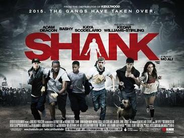
Shank - Poster deconstruction

Shank


Shankposter1.jpg

Colour 


The 2 prominent colour in this poster is blacks and a darker white. These are used in relation to each other actually fading with one another from white to grey to black. A dark red is also used but only in the typography. This is very smart as the title of the film is 'Shank' and the definition of this word to stab, thus allowing the deep colour of red to symbolise for blood. As this is the only red used in the poster, it has a large impact on the audience. There is also a shape of a person within the 'A' in 'Shank' holding what seems to be a knife. Behind the typography, the colour scheme is light and around the light there is dark, allowing the typography to be very distinctive. There is light within the dark, which may have metaphorical meanings.

   Tagline

The tagline of this poster is '2015. The gangs have taken over.' This 1.) Notifies the audience when the film is set and 2.) Has the intent to generate some sort of fear within the audience as the film was released in 2010, yet has a dystopian setting only 5 years from then. To read this tag line and have the idea that in 5 years everywhere could be taken over by gangs would have you curious and possibly hooked.

Typography

The typography as mentioned is the only red on the poster which makes it very obvious and distinctive. The name of the film means 'To stab' which is heavily linked with the colour red and blood, thus the deep blood-like shade of the red. A shape is also cut out of the A in the shape of a person holding a knife. The typography is actually imaged in such a way that it is behind the actors on the poster as if they are running away from the violence in the typography and even the dark crowds of people behind all the actors. Some of these are achieved through post production like the person within the 'A' and the riots of people behind the actors. In the sky there are also a few people and this was again achieved through post production and made more opaque to blend in with the sky, maybe suggesting that this life will eventually conclude with you passed away in heaven/hell, slowly fading away.

Monday, 23 April 2018

Poster deconstruction - Adulthood

Adulthood poster deconstruction


  • A common convention of film posters is an impactful title. The film name 'Adulthood' is positioned in the center and written in bold black writing in the same typography as its sequel Kidulthood, creating an identifiable link between them both. The black also works as a contrast on top of the lighter, orange background helping it to create a  more profound acknowledgment. 
  • The title acts as branding for the film and a recognisable image that can be used for film advertising
  • The film poster has several positive film reviews from commended sources giving the impression it is a well acclaimed and loved film. These comments are situated at the top of the poster in text almost as large as the main title. This ensures to immediately grasp the attention of viewers so they instantly know the film is 'phenomenal' as spark their interest. 
  • The main image of the cast is that of a similar style to Kidulthood, where they are positioned in order of importance, with the main character being at the front showing how he is important and  leader of the group. 
  • The characters are wearing very urban, street-ware such as hoodies and jeans, thus reflecting the common conventions of a social realism genre.
  • The colours used for the background is an ombre of warm-toned orange and yellows which is a great change from Kidulthood. this could suggest that this film has hope for a happier ending due to the connotations of the bright tones. 
  • The use of the star rating is a quick and easy way to portray the exceptional reviews the film has.
  • The bottom of the poster explains the release date allowing the audience to be waiting for its release, allowing time for the word to spread and create a greater buzz surrounding the film.
  • The small print also provided the audience with the opportunity to download the film trailer to be downloaded creating a link between the ancillary texts which expands its audience reach. 

Saturday, 21 April 2018

Website deconstruction - The Hunger Games

The Hunger Games - Website deconstruction


The four action adventure films within the Hunger Games series are based on The trilogy of novels, by the American author Suzanne Collins and have proven to had huge global success. 


  • The immediate focus when the webpage is opened is the title, written in a bold font which is the same typography carried throughout all of the films. The colour is much lighter and huge contrast to the background colour continuing to make it stand out.
  • The slogan 'every revolution begins with a spark' is a powerful portrayal of the film, and it provides a unique attachment to the film making it more memorable. 
  • It is noticeable that in the top right corner there are 'share' and 'follow' hyperlinks. This provides access to several of their other media platforms to expand their media influence and reach a larger audience. It informs people that The Hunger Games also has a twitter and Facebook which they can interact with allowing fan interaction too, thus spreading the global reach
  • The film trailer automatically plays when entered into the website so viewers automatically watch it which could interest them
  • There are also large image of the film DVD as well as promoting the other films within the series, and these are all linked to a page to purchase it, making it easy for viewers to buy improving the films overall proceeds.
  • Several links at the bottom provide easy access to buy the movie' 
  • The colour palette of the website is complementary to the website and film itself thus creating an identifiable brand continued through the series


Wednesday, 18 April 2018

Website Deconstruction - Room

Website Deconstruction - Room


  • The GUI of the website is cleverly designed - the website transitions onto the screen to form a room-like box.
  • Interestingly, the user is not taken straight to the webpage but to an initial homepage where they have to click "Enter site' to visit the page - is this something we would consider incorporating into our own website?
  • The initial webpage displays a photograph occupying the screen of the two protagonists embracing, giving a hopeful tone to the film.
  • A key point to note from this website is that the colour palette used frequently throughout the film is used in the website.
  • The colour is consistently cool toned and blue, with a contrasted yellow font
  • The website shows the awards the film has received - the cover webpage shows an image of the iconic oscar award to inform the viewer of the success of the film.
  • Once the viewer clicks "enter site", sound and video are utilised as a clip from the film plays alongside a soundtrack of the main protagonist's signing voice. This establishers to the viewer the fact that a relationship exists between the two characters.

What inspiration can we draw from this?

  1. The use of a similar colour and font scheme to establish a clear promotional package.
  2. The slideshow of critics' feedback appearing at the top of the webpage - the text appears one after the other so as to not appear overbearing
  3. The use of a

Monday, 16 April 2018

The Rule of Thirds

The Rule of Thirds

When shooting scenes for our film opening, we wanted to maximise the effectiveness of each and every shot. The rule of thirds is a theory devised to ensure that each shot is appealing to the eye, while maintaining its symmetry and balance. The rule of thirds applies both within photography and film.

Above shows an image composed with the rule of thirds.

The theory is based on scientific research that the human eye automatically and subconsciously gravitates to an insertion point when an image is split into thirds. The theory also states that the main focus and interest of the shot should be situation in the first and second thirds of the shot. The focus of the image can be placed on the right or left hand side, however it must remain within only the two thirds. This is demonstrated in the image above, with the building located within the right hand two-thirds.


Shown above is a still from our film. As you can see, the railings and the line between water and line align with the horizontal thirds. Vertically we wanted to keep our shot symmetrical for aesthetic value so we kept our protagonist central rather than framing him in the left or right third.

Website Deconstruction - Moonlight

Website Deconstruction - Moonlight


  • The initial webpage when the website is clicked on shows a fading transitional slide show of the three stages of Chiron's life as he appears in the film. This indicates to the viewer that these characters play an integral role in the narrative - the three men signalling that themes of masculinity are prominent within the film.
  • The title is clear and distinct across the screen, however is written using a delicate typography so as to not distract the viewer from the photography. 
  • The photographs occupying the entire screen are particularly emotive - the heavy focus on eyes provoking empathy from the viewer. As a group we can hopefully take inspiration from this apt use of a still image to convey a meaningful message. 
  • The webpage also utilises social media by including links to the film's twitter, facebook and instagram. The links are small and discreet, however still legible in a white font. 
  • The tagline features on the webpage, however is relatively discreet in relation to the film's title. The Academy Award for 'Best Picture' is privileged over the tagline as it is more likely to attract potential viewers.
  • It is interesting to note the use of "Follow the story" in the bottom left hand corner of the webpage. The arrow underneath it signals the viewer to scroll down - leading them towards the rest of the webpage which has a scroll interface similar to those of popular social media networks. The simple scroll nature of the website is aesthetically pleasing and comfortable for use, especially for younger audiences as the website reads similarly to a blog or twitter feed.
  • "Follow the story" resonates as something giving the film a narrative that extends beyond the film itself. Being a talked-about zeitgeist film due to its theme of masculinity and predominantly black cast, the film is more than just a story. Black men are statistically greatly underrepresented in the film industry, making "Moonlight" a story of black success made evident by its website.

  • Above is a screenshot of part of the website. The website features headlines in a news outlet style fashion, with images and transitioning text adding aesthetic value to the site.

What inspiration can we take from this?

  1.  A website that flows - allows for easy viewing, modern and aesthetically pleasing.
  2. Image focussed - aesthetically pleasing as image is able to dominate the screen
  3. Suitable privileging of typography - most important text to be the largest
  4. Inclusion of reviews

Thursday, 12 April 2018

Trainspotting - Poster Deconstruction

Trainspotting - Poster Deconstruction

Rob O'Connor, the owner of Stylorouge (the firm that designed the original Trainspotting poster) said that "We didn't really want it to look like any other film poster."

The poster does not follow the traditional conventions of a film poster - it is constructed with simply three colours - orange, white and black. The bright orange colour palette adds a unique and recognisable element to the poster, along with the Helvetica typography resembling the type of font one might see on hazardous materials or a prescription drugs. 

The actors are shot in character, each posing in a way that divulges some detail of their character - for example Begbie is shot posing two fingers towards the camera, which is indicative of his crude and violent character. Similarly, Ewan McGregor who plays Renton is soaked in water for the shot which is reminiscent of the scene in which he climbs into a public cubicle to retrieve his lost opiates. The characters are all shot facing the audience, breaking the fourth wall which adds an eye-catching and personalised touch to the poster.

The black and white shots of the actors arguably reflect the drab and dull nature of the character's lives. Although the drug use which is recurrent in the film is not made completely obvious, it is subtly hinted at. Renton appears cold and shivering, which is a common symptom of drug use. Colour is also utilised with the use of bright orange being reminiscent of prison uniforms - reinforcing the notion of entrapment in the narrative

The poster makes an effort to market unique selling points of the poster - by including text "from the makers of Shallow Grave" fans who have seen the film will be tempted by the new project. Similarly, the review stating "Hollywood... Your time is up" is designed to attract more of a niche, cult following rather than a generic US box office.


Monday, 2 April 2018

Under the skin website deconstruction

Under the skin website deconstruction

  • Colour scheme is mostly black, which is aesthetically pleasing for the audience
  • Ongoing gif in the background changing colour on the main protagonists cheek and the text changes too
  • Main actors name underneath her lips
  • Simplistic view which is also aesthetically pleasing. There is consistency through colours, fonts etc. most website conventions are conformed to.
  • Extreme closeup on her face which is similar to the trailer  
  • Website is extremely easy to navigate around and there is a link straight to the reviews page with a page full of reviews and quotes about the film , engaging the audience even more. There's also trustworthy star rates views from notable newspapers.

Friday, 30 March 2018

Fishtank - Trailer Deconstruction and Inspiration

Fishtank - Trailer Deconstruction


Andrea Arnold utilises the Fishtank's teaser trailer to depict the protagonist Mia as a misunderstood teenager, bound by her disadvantaged family background. The trailer includes stock images of the council estate she resides in, reflecting Arnold's Preferred Reading that Mia has been failed by society. The high angle shot of Mia looking down the stairs at her mother after their argument portrays the separation between the pair, and the lack of love and closeness. This notion of Mia lacking affection is crucial to the narrative as she seeks love from her mother's boyfriend, Connor.

Arnold places the trailer against a soundscape of a dramatic non-diegetic soundtrack alongside the diegetic on-screen sounds. The music is parallel to the pace of the trailer, building tension leading to a climax that we see at the end with Mia dancing. This gives the audience a subtle insight into the narrative as Mia's dream of becoming a dancer becomes apparent.

Inspiration - Rocky II

Rocky - Inspiration


We wanted to include intertextuality to add familiarity to our teaser trailer. Upon watching the Rocky II running scene we wanted to replicate this in our piece. We felt that the montage shots tracking Rocky kept continuity throughout the sequence, while portraying the archetypal sense of masculinity.  To replicate this within our teaser trailer, we filmed various backwards tracking shots of our protagonist running through various locations. The example below is a vertical tilt high angle shot coupled with a low angle of the protagonist's feet. As you can see we took inspiration from Rocky II, while making the sequence our own by including the close up shot. 


Sunday, 25 March 2018

Dunkirk website deconstruction

Dunkirk website deconstruction

Before creating our our own website for our teaser trailer 'Quicksand', it was vital that we assed the quality of current websites for film prodcutions that are successful on a large scale. This allowed us to discuss what we belived worked well and what could be improved, as well as discovering potential  inspiration thtat can be applied to our final piece. 


  • I decided to look at current website of large budget movies to see how their promotional package was designed for mass coverage. When entering the 'Dunkirk' website, the trailer fills the page and immediatly begins to play. This is a clever technique as it ensures the audience will watch the trailer and create interest towards the film already. Once on the actual websie page, I noticed that it has a very dark colour sceme which not only fits the pallet of the promotional poster but also the film itself. Aswell as this the typography was the same too. 
  • There are direct links to 'Watch trailers' and the 'official sountrack' in the centre of the page, encouraging viewers to explore the film further.
  • Additionally, there were links to 'Order now' and the 'Web VR game' which again encourages sales for the production. 
  • The layout of the website is very neat and symmetricle which is very asthetically pleasing but provides a professional appearance too.
  • Noticably, there were linked social media handels including Facebook, Instagram and Twitter, thus expanding the promotion of the film over several platforms.

Monday, 5 March 2018

Website Deconstruction - Avengers Infinity War

Website Deconstruction - Avengers Infinity War


The immediate focus when the open the page is the bright colour picture with all characters from the new film. The bright deep colours attract the viewer instantly to look deeper into the picture.
The bright centre on Iron Man's chest draws attention straight to him, as he is the initial character of the franchise. 
The title, written in gold bold font has been carried throughout all of the films and stands out well against the black background, showing strong marketing skills and continuality
The contrasting colour palette is complementary to the website and poster creating a brand for the franchise.
All characters have similar facial expression showing that they are on a mission to defeat something.
The larger character above the others, Thanos, is made obvious that he is the antagonist as he is larger than the rest, and the ring behind him highlights his importance. 
The solar elements of the website help assist in understanding the sci-fi action genre.
There are links to the trailer which takes you straight to a video inserted onto a separate page. 

There are links also to social media and the logo is shown in the top corner, in different format to the rest of the poster to help it stand out.

Also, they have chosen to not use a tag line, perhaps because Marvel is such a secret and anticipated franchise, where things are kept secret until the release of the film. 
The marketing on this poster is effective, as there are links to tickets as well as merchandise. 


The empty space around the bottom and corners helps to highlight the importance of the characters and how central they are to the movie. 

-Caera Mendez

Thursday, 22 February 2018

Poster Deconstruction - This is England

This is England

Colour


  • The first thing I chose to focus on was the use of colour. The prominent colour scheme is red, white and blue which are the colours of the Union Jack. 
  • Due to the subtle association of these colours with skinhead groups such as the English Defence League and Britain First, the colours coupled with the film's title indicate to the audience the general thesis of the film.  
  • The general colour palette of the poster is a collection of blue, grey and red hues. Continuing the colours of the union jack, the poster is aesthetically pleasing. Below is a colour chart I made depicting the various hues used.

Mise en Scene

  • The characters are dressed in stereotypical 'skinhead' outfits - combat boots, bomber jackets and Ben Sherman shirts - giving away details of their character.
  • High rise flats are in the background of the shot - indicates the film is set in a poor area.

The Tagline

  • The tagline "Summer 1983. A time to stand out from the crowd." gives away when the film is set.
  • The notion of standing out from the crowd relates to the mise en scene of the character's costumes and hair/makeup.

Post Production

  • It is possible that the actors were positioned alongside each other for the photograph, however it is likely that they were placed individually against a green screen in order to be edited onto the background.
  • Film festivals and award logos are placed horizontally along the top of the poster - they are placed against the blue sky in order to stand out.
  • The text is placed carefully in order to not obscure any of the buildings or characters.
  • The film's website address appears on the poster.
  • Critics' reviews of the film appear at the top of the poster, persuading the audience that the film is worth watching.

Typography

  • The style of the 'THIS IS ENGLAND' main title is the largest and boldest text on the poster.
  • The typography is styled as thought it has been painted onto corrugated metal - indicating an urban setting for the film.


Monday, 19 February 2018

Trailer deconstruction - Brotherhood

Trailer deconstruction - Brotherhood


Structure

  • The film starts with a time lapse of London from day to night with a voiceover saying 'Times Change'
  • There are then quick montage scenes of London, concerts, family, police and death up to 0:13 seconds. 
  • Throughout the majority of this trailer there is quick fast paced editing often followed by montages. 
  • After 0:13 seconds, there are scenes violence, death, love , sex, money , family and multiple scenes representing solitude. 
  • The violent/chase scenes are more short montage editing , whereas love and family seem to be more prolonged. 
  • The last scene is the main protagonist looking down, seemingly after a fight with a face full of scratches and once again he is in solitude.

Sound

In the first scene where there is a time lapse of London from day to night, firstly there is a cinematic trailer impact sound, followed by an offscreen, yet diegetic narrative saying 'Times Change'. This goes with the scene is it shows the transition from day to night in London.
The narration then continues, also accompanied by the non-diegetic impact hit, which is synchronous to the scene with the quick cut editing. We then find out this was all a soundbridge at 0:11. At 0:13 seconds  uk hip-hop starts playing which comes to an end at 0:24 seconds. This is all part of the tension build and at the second drop UK grime is played at 0:33 seconds. At 0:37 the grime pauses and plays once again at 0:40 when an action scene has started. These stops and starts of the music all contribute to the overall effect and tension of the trailer enticing the audience. From here on, the cinematic 'boom' sound effect starts again synchronous to every new action scene shown.

Typography

  • The typography is clean and bold and white in all-caps. In other genres like this there would be an overlay in the 'old movie' effect, however in 'Brotherhood' the font itself has the effect of an older movie 

Monday, 29 January 2018

Moonlight poster deconstruction

Moonlight Poster Deconstruction-


  • This poster on the whole remainsrather ambiguous as it doesnt provide much information about the plot of the film, yet it still intrigues the audience into wanting to watch.
  • The font of the title is in the same font as in the film, allowing the audeicne to make that connection to the poster, making it identifiable. 
  • The extreme close up shot of the character is framed in the centre diverting all attention to him, and in particular to his eyes. He is looking directly into the camera and to the audience, which creates an effective connection with the audience. 
  • The image of his face is cleverly separated into three separate images which are effortlessly merged together by the use of three different colours. these colours are all in a deep blue colour pallet which  provides connotations matching the title 'Moonlight'. 
  • The background is all negative space in the colour blue, again ensuring no distractions are taken from the centre of the picture. 
  • There are several scars across his face and the one on his head is covered by the durag, this suggests that he may feel ashamed about this part of his life and that there may be a deeper reason for the scar.
  • The audience may identify the other scars on his nose again making the audience question the causes luring them in to watch the film.
  • The third image shows the man having facial hair representing masculinity and that he may have grown and matured in the third picture. This suggest that each of the three pictures represents different stage of his life and documents how he has grown. 


Fish tank poster deconstruction

Fish Tank poster deconstruction-


  • The positioning of Mia is framed to the very edge of the poster and she is seen to be looking out of the window. This portrays the view that she is an outcast of society, trapped within the reality that she is stuck in although she is aware of the better life that isn't available to her.
  • The fact that she is pressed up against the window gives the impression that she is trapped like a goldfish, coinciding with the title.
  • The mise en scene of her clothing and makeup is very simple which could be a reflection of her low economic class. She has a plain black short sleeve top and the gold jewellery can be viewed as 'chav' like, showing she feeds into the British working class stereotype. 
  • As well as this her appearance is quite masculine, coinciding with her character as she lacks femininity 
  • The wall behind is damaged and stained with drawings and scribbles. The lack of white on the wall perhaps reflects the absence of her prurity and that he life if full of scars and imperfections.  
  • The lighting used in this poster is interesting as Mia is presented in the light, almost angelic like. This portrays her as the innocent character so the audience is drawn to empathise with her, despite her bad behaviour throughout the film.
  • The colour of the title 'FISHTANK' is blue which works well with the literal idea of inside a fish tank as it represents water, but also is effective next to the pink writing. This could show the contrast between stereotypical 'girl' and 'boy' colours which not only reflects her characters lack of femininity but also highlights how her relationships with men in the film have been damaging. 
  • The star system is an effective way of attracting the audience as a four-star film would seem desirable to watch.
  • The writing on the walls can in some ways symbolise graffiti which is typical mise en scene in a social realism film, thus hinting at the genre of the film.

Monday, 20 November 2017

'Under the Skin' Trailer Deconstruction

Under the Skin - Teaser Trailer 

I decided to deconstruct the teaser trailer for 'Under the Skin', a 2014 film featuring Scarlett Johansson.

Structure

  • The trailer opens with a black screen - this creates a sense of uncertainty within the audience whilst building tension.
  • Next a close up circular figure consumes the screen, getting larger. This section is interesting as it is very long, lasting from 0:07 until 0:52. This slowly increases the tension and confusion within the audience.
  • The black circle eventually consumes the whole screen before it changes into an eye. This acts as a release of tension for the audience as the mysterious shape becomes identifiable, which provides a sense of reassurance.
  • The next section is a montage edit of scenes from the film. A long shot of a dimly lit road is followed by various eerie shots of the characters at different stages in the film. Each clip lasts no longer than a second.
  • The final shot lasts for a few seconds, showing a floating skin from one of the victims - this lingers in the audience's minds and provokes questions as to how the body came to be in such a state etc. These questions leave the audience keen to watch the rest of the film.

Sound

  • The first 'eye' shot contains an eerie, creaking sound that reappears throughout, as well as static sounding electric sounds and a wind effect. In unison, the music sounds discordant and out of time, creating a tense and eerie sound. This sound builds in thickness as the shot duration increases.
  • When the shot of the eye is replaced by the shot of the road, the music stops completely and is replaced with the parallel rhythmic percussion sound. The images on screen change with each beat which adds a sense of unison between the visual and aural aspects of the trailer. 
  • The last shot is coupled with a contrapuntal string instrument sound. The chord is played in a minor key with discordant notes added to contribute to the sense of uneasiness and foreboding.
  • The final slow percussion compliments the credits on screen, essentially 'rounding off' the piece.

Typography

  • Typography of critics' reviews is shown on screen in a very quick cut montage, making the text barely legible. However the key words are readable as they remain on screen just long enough to be read.
  • The text is of a bold, clean, white font in an all-caps style lettering. This adds a certain professionalism as well as readability.

What can we take from this 

  • I like the eerie long shot at the beginning to build tension.
  • The extreme close up shot of the eye makes it appear unrecognisable and disorientating, which is effective in establishing the film as a science fiction.
  • The quick montage of typography is something we could apply to our own piece to display critics' reviews.

Thursday, 12 October 2017

Dunkirk Deconstruction

Teaser Trailer Deconstruction- Dunkirk


Since our groups initial idea for our teaser trailer was the theme of masculinity, the film 'Dunkirk', an intense plot focusing on the plight of soldiers, seemed very fitting to research and gather inspiration from. 

Analysis of teaser trailer- 

  • The opening shot of the foamy sea immediately displays a colour scheme of predominantly dull greys which effectively give a very sombre feel to the trailer, perhaps foreshadowing the key personality of this film. 
  • This works well with the low key lighting, although it is natural light it has been manipulated to give a dull an lifeless atmosphere.
  • Personally, the highlight of this trailer for me is the effective use of sound. The non diegetic off screen ticking sound of a clock is consistent throughout the majority sequence, increasing speed within. This is an excellent way of building up the tension in the scene as it is not until the end of the trailer we, the audience, realise it is actually the sound of a bomb, producing immense terror. 
  • This sound is interrupted by the high pitched piercing sound of the bomb approaching, which increases in sound highlighting it coming nearer. This works effectively as the sound represents the danger and we can see this the characters responding to this fear.
  • The vast open space of the location in this teaser trailer is perfect to present the men as isolated and very alone. The emptiness of their surroundings compliments this making it very lifeless. We can use this as inspiration when selecting our filming locations as wide open spaces seem particularly good to represent isolation.  
  • All the men are dressed in the same, army uniform consisting of camos and helmets. Although this soldier attire can highlight their masculinity and make them seem powerful, the fact that they are all identical eliminates their identity as they are not classified as individuals but instead as a group. 
  • The mud and dirtiness of their skin can arguably represent the toughness and strength of the men which again helps to present a bold masculine view
  • The effective use of post production helps intensify the teaser trailer. The visual shot is interrupted by black screens with text that slowly enlarges, however the sound is still continuous. 
  • The presence of the black screens which appear contain some text providing a brief few words about the film such as 'survival is victory'. The fact that they quickly appear and reappear increase the speed of the teaser trailer.

What we can take from this deconstruction-

  • This trailer has demonstrated an excellent use of sound therefore we will ensure we focus on this technique to create a huge impact in our own trailer
  • This teaser has also inspired our typography as it presents a simple, but effective use of reviews that compliment the intensity of the trailer
  • Since our trailer is based upon masculinity and isolation, we will take note of some of the camera work used. There were effective the huge open shots of the beach, especially when the man is surrounded by negative space, as this really represents his isolation which we will use as inspiration when filming